Visualizing POTA Activations: Generating Azimuthal Maps from ADIF Logs
As an amateur radio operator I like to do “parks on the air” activations and operate out in the wild. Setting up the portable radio station in a park and operating using my voice for single side band or morse code for cw operation is just a real joy for up to a few hours.
After some activations I post about the activation over on mastodon. For that I would snap one or two pictures that show the setup and the location. To give a deeper insight into the particular activation I wanted to top that up with a summary of the contacts. At first, I just included a screenshot of the map view of my logging program (Wavelog1), like in this early post. That way people can see at a glance how many contacts I had, how far I reached and which countries I got in contact with.
That already gave an impression, but I wanted to convey even more information. The reader should get a better feeling on how far the contacts really were apart. They should get an idea of how many contacts were done on which band. To bring it even further, I wanted to show how my QSO2 rates were on certain transmission modes or bands. All in all that should really give a rich picture how the radio conditions were on that day.
So I came up with the idea of creating my own unique map design for sharing pictures of maps for amateur radio activations, like this one.
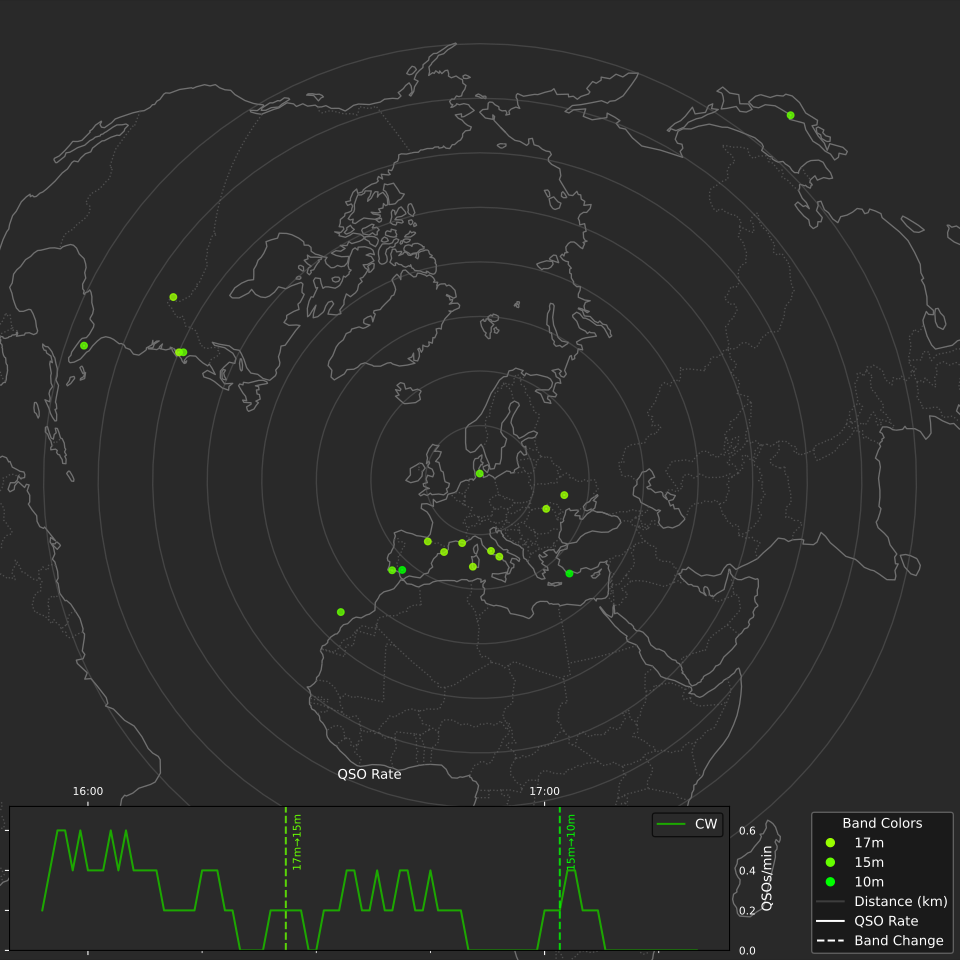
I was looking for libraries that I could use to accomplish what I wanted and settled for the Python ecosystem. The cartopy library provides an easy interface to render maps using different projections. It also comes with cartopy.crs.AzimuthalEquidistant, a map projection other than the Mercator projection that we all are used to from for example online map services.
Why Azimuthal Equidistant?
It works like this: Imagine you’re standing in the middle of the map at your location, looking down. You flatten everything you see into a circle around you. On the map you are at the center. Distances in every direction from you are the same. If a contact is 2,000 km away in real life, it’s exactly twice as far from the center as one at 1,000 km. Lastly, if someone is northeast of you in reality, they’re northeast on the map too. That way you exactly see the contact on a line at the correct degree from your antenna. This is great for directional antennas as you will be able to see, for example, if all of your contacts are in a certain direction. It is pretty much what you would see on a radar screen.
There are some downsides as well. Shapes and areas get increasingly distorted the further you go from the center. Continents near the edges look stretched. The resulting map might look unfamiliar. For what I want to show in my map that projection is really nice though.
Cartopy supports taking the continent outlines from a public domain dataset and map it towards that projection. Those outlines are vector graphics so it is possible to export an .svg file in the end which scales nicely.
Putting Contacts on the Map
Next I wanted to add the stations as colored dots onto the map. For that I take each contact’s maidenhead locator3 from the ADIF4 logfile of the activation. That gets converted to geographic coordinates which then can be put on the map by applying the projection. I can add additional information from the contact like for example the band that contact has been logged on and, depending on that, color the dot on the map accordingly.
Graphing QSO Rates
To be able to see how the activation progressed I added a graph showing logged contacts per minute in 5 minute windows. It highlights the different bands and modes for easy comparison.
The plot is done with matplotlib, a Python library that allows to plot different kind of data graphs.
The graph together with the map really tells the story of the activation. In the example shown above you’ll be able to analyze it like this. First you take a look at the map. You see contacts across Europe and some on the west coast of the US. That is not bad for a park activation so you dive deeper. Taking a look at the QSO rate you’ll see that all of the contacts were worked in CW, which is Morse code. There are three bands used in this activation. 17m, 15m and finally 10m. You see that the band changes occurred each time after a drop in the QSO rate. The activator worked each band until there were no more stations calling them, then switched to another band. You see they operated for about 1 and a half hours from 15:45 until about 17:30. See what I mean? A powerful visualization conveying a lot of information.
Try it yourself
I have received requests from multiple people asking how I created my shared maps so I have published my map tool as azi-qso-map on codeberg. Finally you’ll be able to just apply it directly to the .adif files of your last activation! The code is available under the MIT license. If you have feedback or want to report issues you can do so on codeberg. Installation and usage is described in the README.md on the project page. I would love to hear from you if you try it out. You can reach out via Mastodon.
Footnotes
Wavelog is an open source web-based amateur radio logbook application, accessible from anywhere via a browser.↩︎
QSO stands for a two-way radio contact between amateur radio stations. The term comes from the Q code system used in radio communication.↩︎
The Maidenhead Locator System is a geographic coordinate system used by amateur radio operators. It divides the world into grid squares identified by short alphanumeric codes like JO53ao.↩︎
ADIF stands for Amateur Data Interchange Format, a standardized file format for exchanging amateur radio logbook data between different logging programs. It is the format being used to upload activations to activity programs like POTA or SOTA.↩︎